Blog Chart Update
The Mission:
re-design the look and format of PIIE blog charts to allow them to be branding and outreach tools
The Client:
PIIE
The Time:
Mid 2018
My Role:
Concept Development, Graphic Design, Production
Other Credits
Steve Weisman: Creative Direction
Melina Kolb: Creative Direction
Melina Kolb: Creative Direction
Blog Chart Style Update
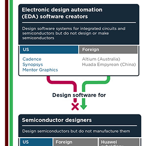
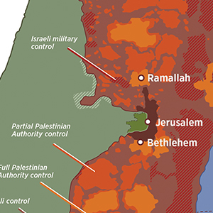
Blogs are used by PIIE as short, relatively non-technical, publications that can be understood by a wide audience. The primary goal of updating the blog chart style was to make the charts more effective communication tools by improving the information hierarchy, contrast, and increasing the emphasis on showing trends and narrative. In addition to visual updates, we changed the title text from a simple data set label to a main title that stated the main idea of the chart, with a subtitle that explained the data set. This made the charts more effective standalone assets and not as dependent on accompanying blog for context. This allowed the charts to be more effectively shared on social media and by outside agencies and news outlets. The second goal was to make them an extension of the PIIE brand and make them effective tools for PIIE branding and outreach. This was done mainly though the incorporation of PIIE colors, logo, and fonts. The visual update also supported the more general visual update though the use of clean lines and a simple but deliberate design style. The final goal was to make PIIE's charts stand out from the charts and graphics of other DC organizations, most of which used charts formatted in Microsoft excel or another template package.
The use of a bespoke solution achieved this goal. An upfront time investment in the creation of templates and an expansive asset library minimized the extra labor involved in chart production, which allowed the bespoke charts to be a cost-effective solution. In addition, not being dependents on a third-party template allowed us to create a wider range of highly specific data visualizations to more effective support the work of PIIE's experts and research staff.
The update has been very effective in increasing the spread of our charts on social media and among major media outlets such as the New York Times and the Economist. Since the update, blog charts have become the most common graphic type shared on PIIE's social media accounts and are among its most popular posts. It has also encouraged PIIE's experts to use more charts and visuals. Particularly, they have been heavily employed by Chad Bown in his coverage of the Trump administration trade conflicts and COVID-19 pandemic.
Blog Chart Update
NewOld
Line Chart Update
NewOld
Pie Chart Update
NewOld
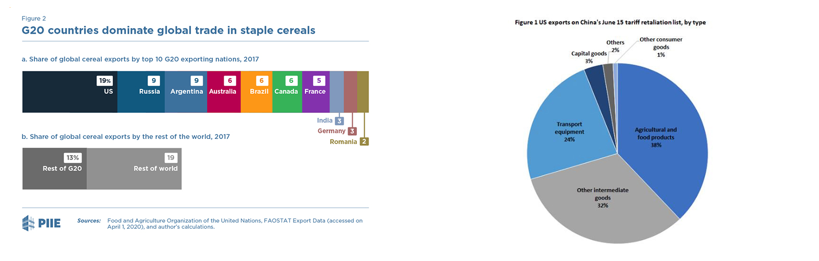
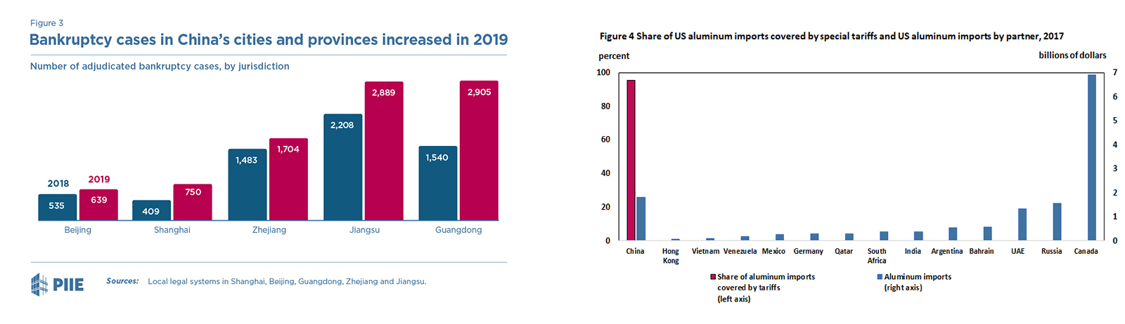
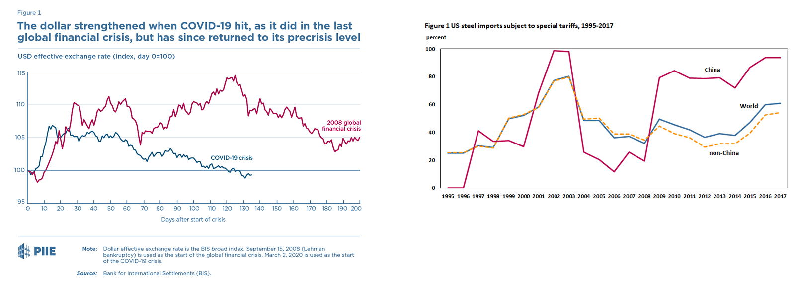
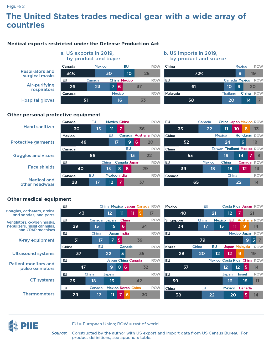
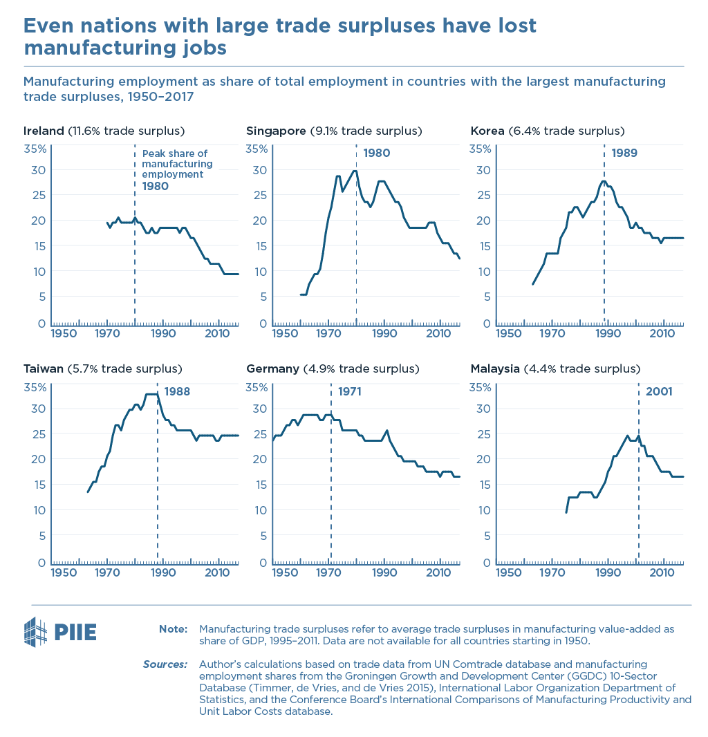
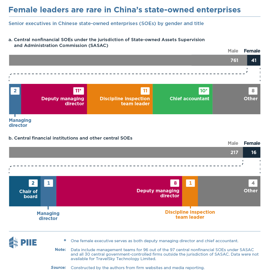
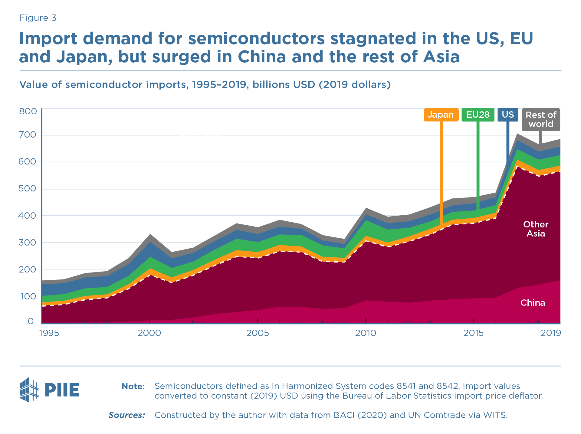
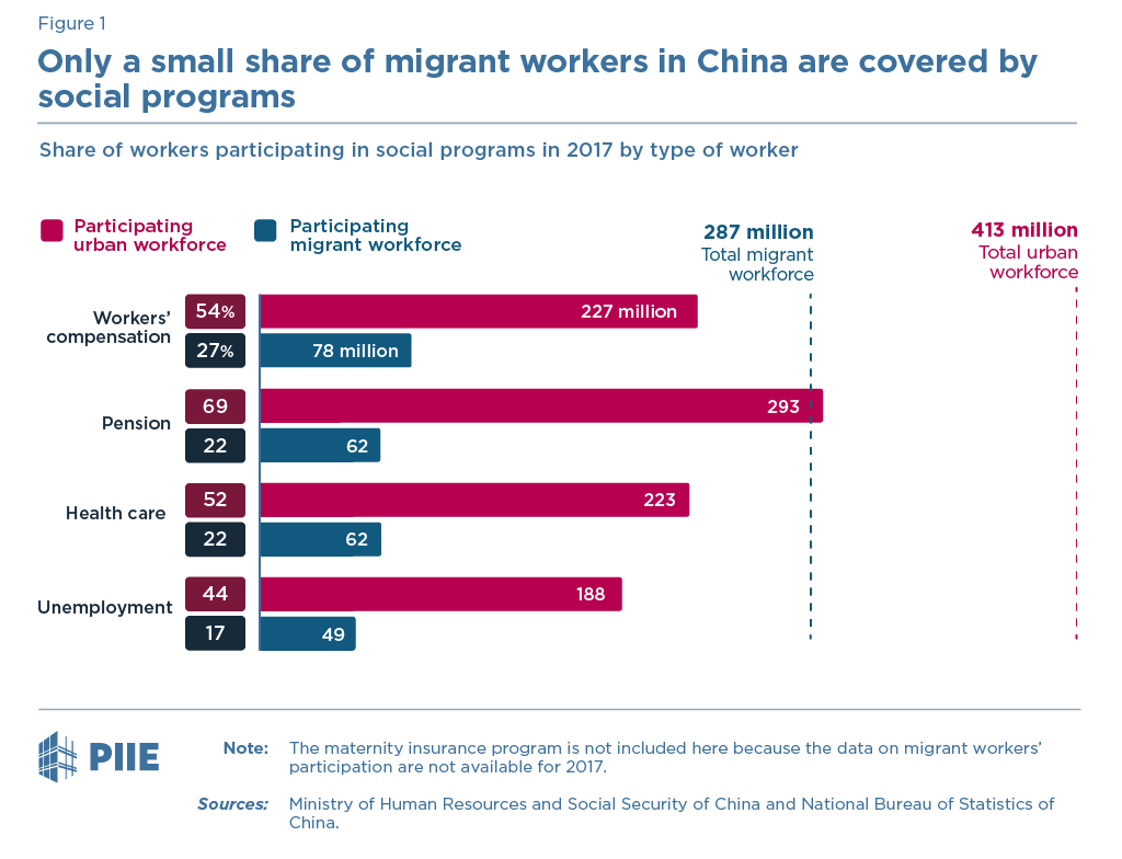
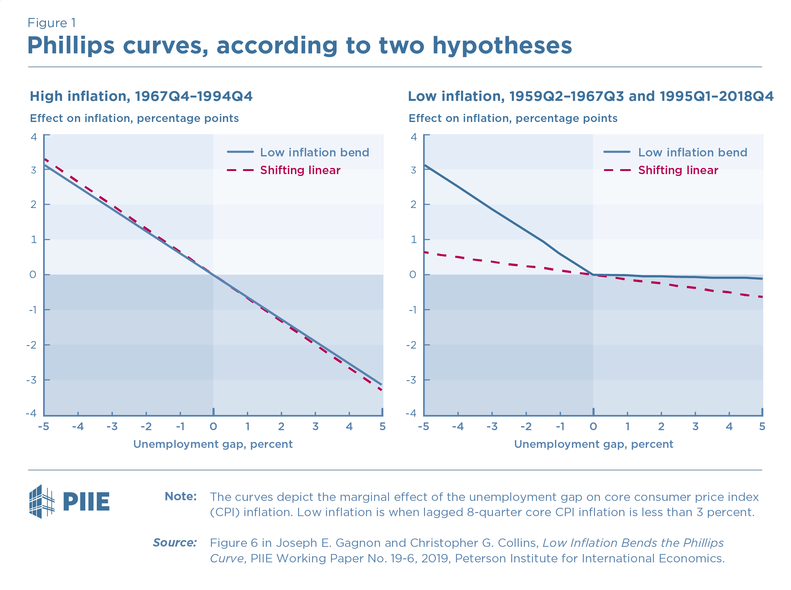
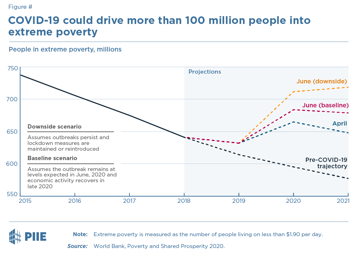
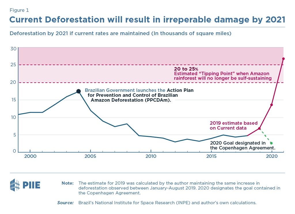
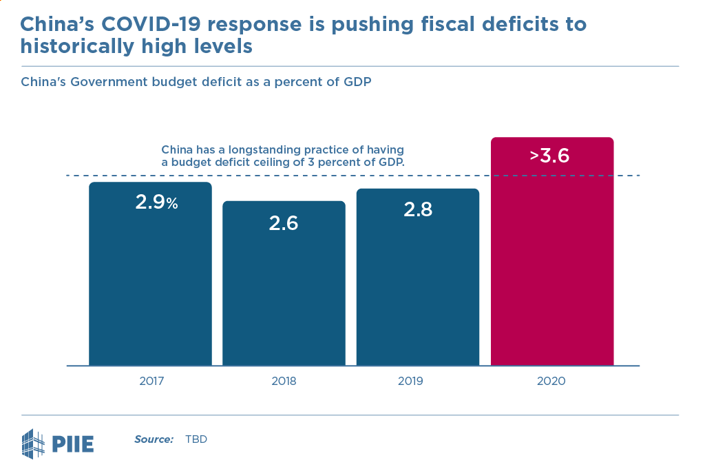
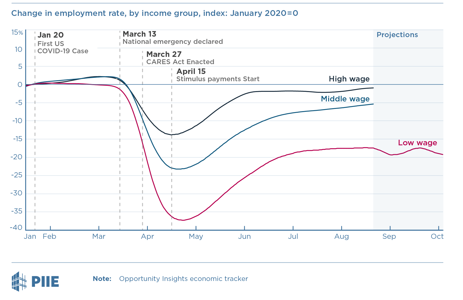
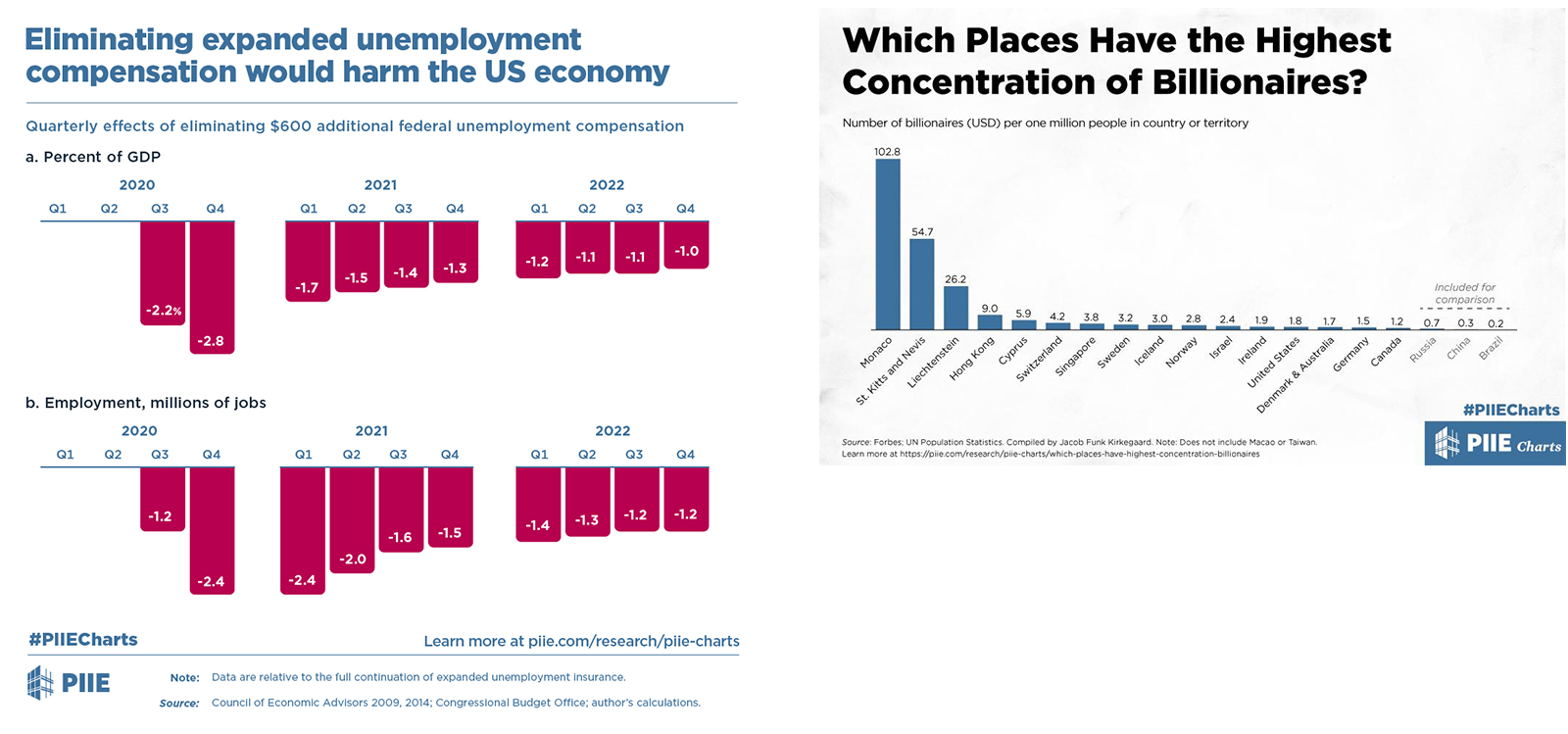
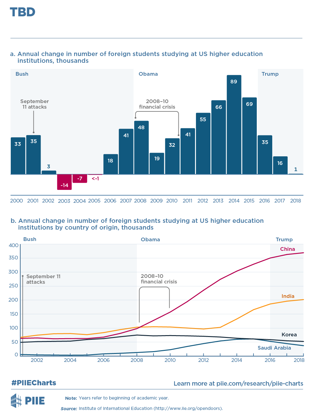
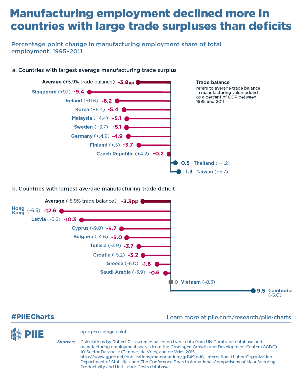
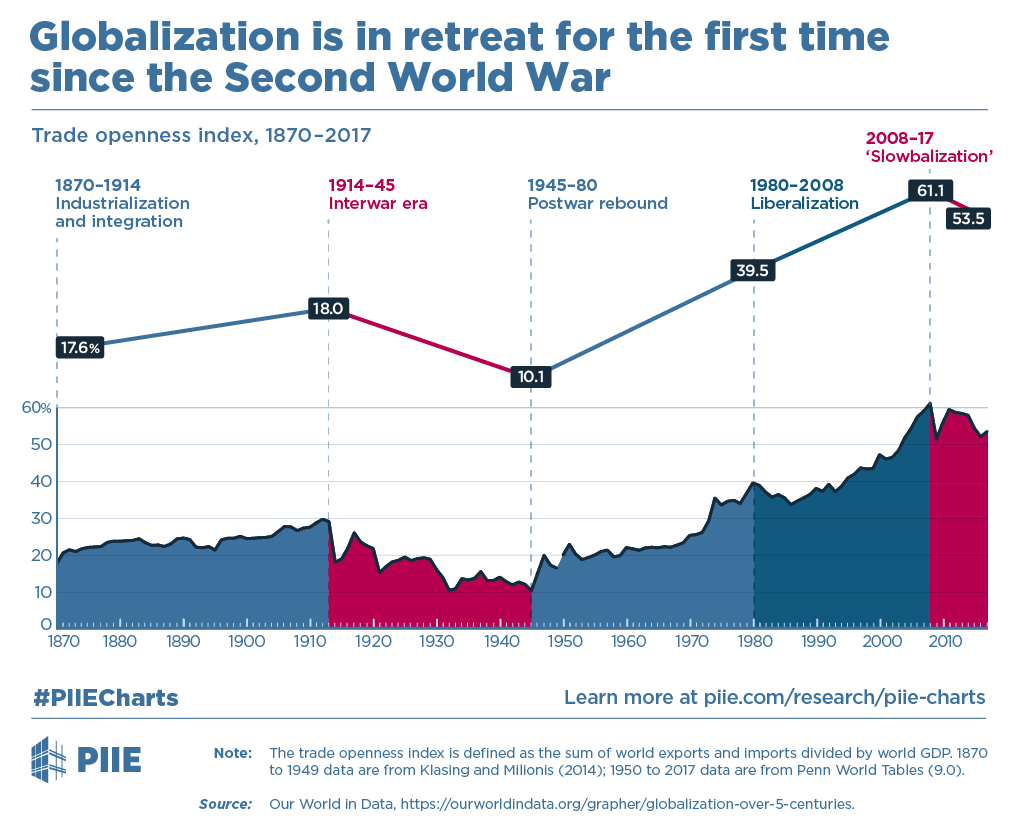
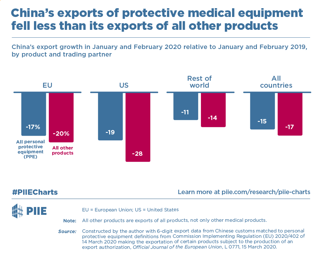
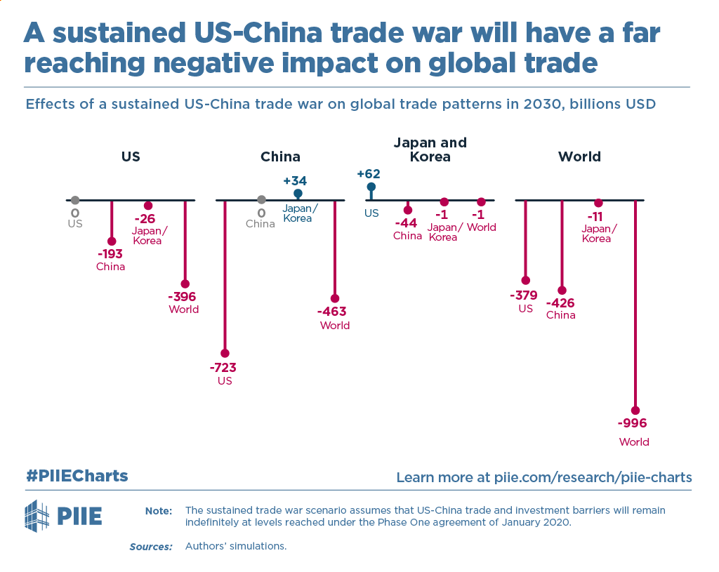
Examples of PIIE Blog Charts
PIIE Chart Update
The Mission:
re-design the look and format of the Piie chart product to support the PIIE blogchart re-design
The Client:
PIIE
The Time:
Mid 2018
My Role:
Concept Development, Graphic Design, Production
Other Credits
Steve Weisman: Creative Direction
Melina Kolb: Creative Direction
Melina Kolb: Creative Direction
PIIE Chart Style Update
The PIIE Chart product was already in use when I was hired as PIIE's visual designer. It highlighted the importance of data visualization to PIIE's outreach strategy. When I updated the PIIE blog chart visual standards, I also pushed to update the look of our PIIE Charts so that all of PIIE's visual data products would have a similar look. The previous design for PIIE's blog charts and PIIE Charts were very different. In addition to creating a more streamlines, sophisticated look, I made the designs similar so that it would be obvious all of the visuals were produced by the same organization. This allowed our visuals to better support each other and PIIE's outreach strategy in general. The PIIE chart became a more elaborate counterpart to the blog charts that would be used to present more complicated or important data sets. PIIE charts continue to be used as effective standalone products but have become much more effective as an integrated part of the larger PIIE visual strategy.
PIIE Chart Update
NewOld
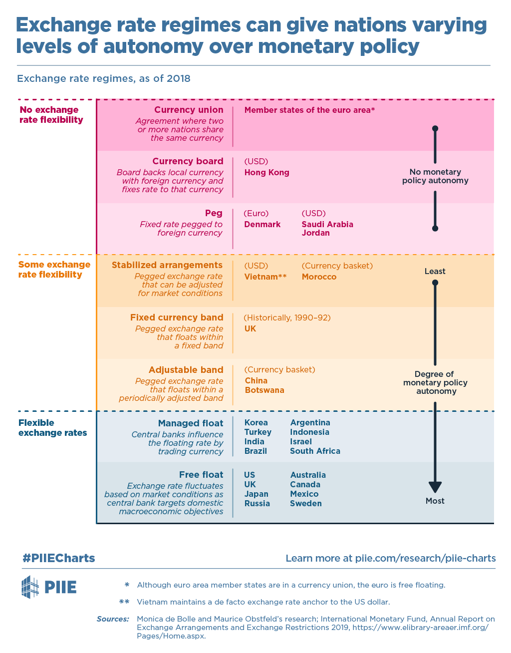
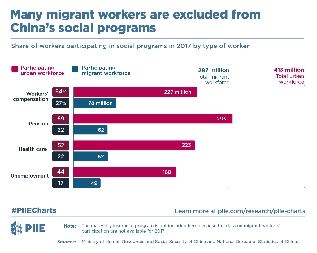
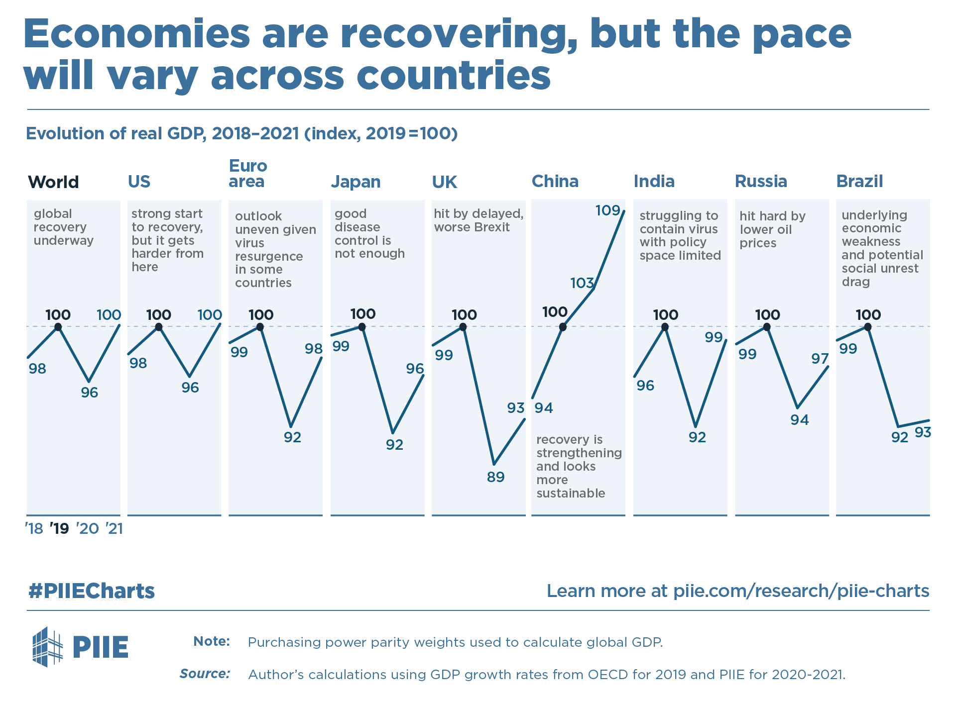
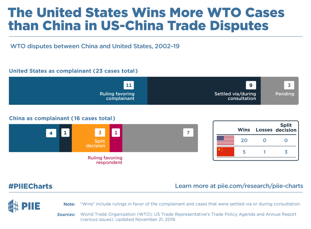
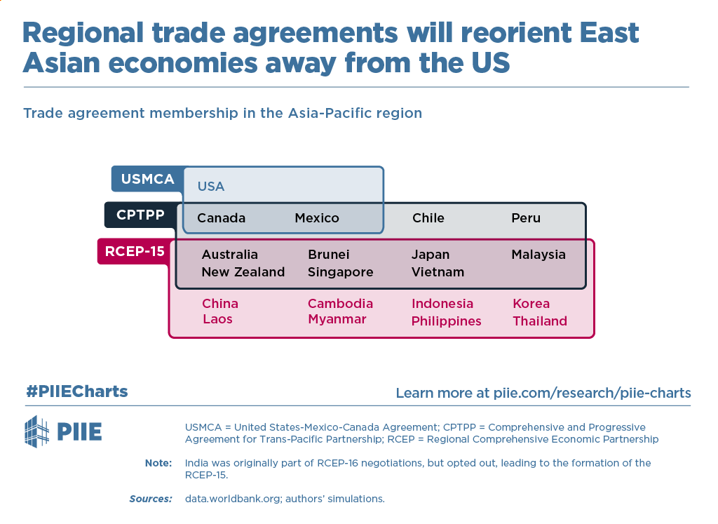
Examples of Peterson Institute PIIE Charts
Editorial Illustration
The Mission:
Create an illustration style that would support the PIIE brand and create interest in PIIE publications
The Client:
PIIE
The Time:
Mid 2018
My Role:
Concept Development, Visual Design, Illustration
Other Credits
Steve Weisman: Creative Direction
Melina Kolb: Creative Direction
Anjali Bhatt: Creative Direction
Melina Kolb: Creative Direction
Anjali Bhatt: Creative Direction
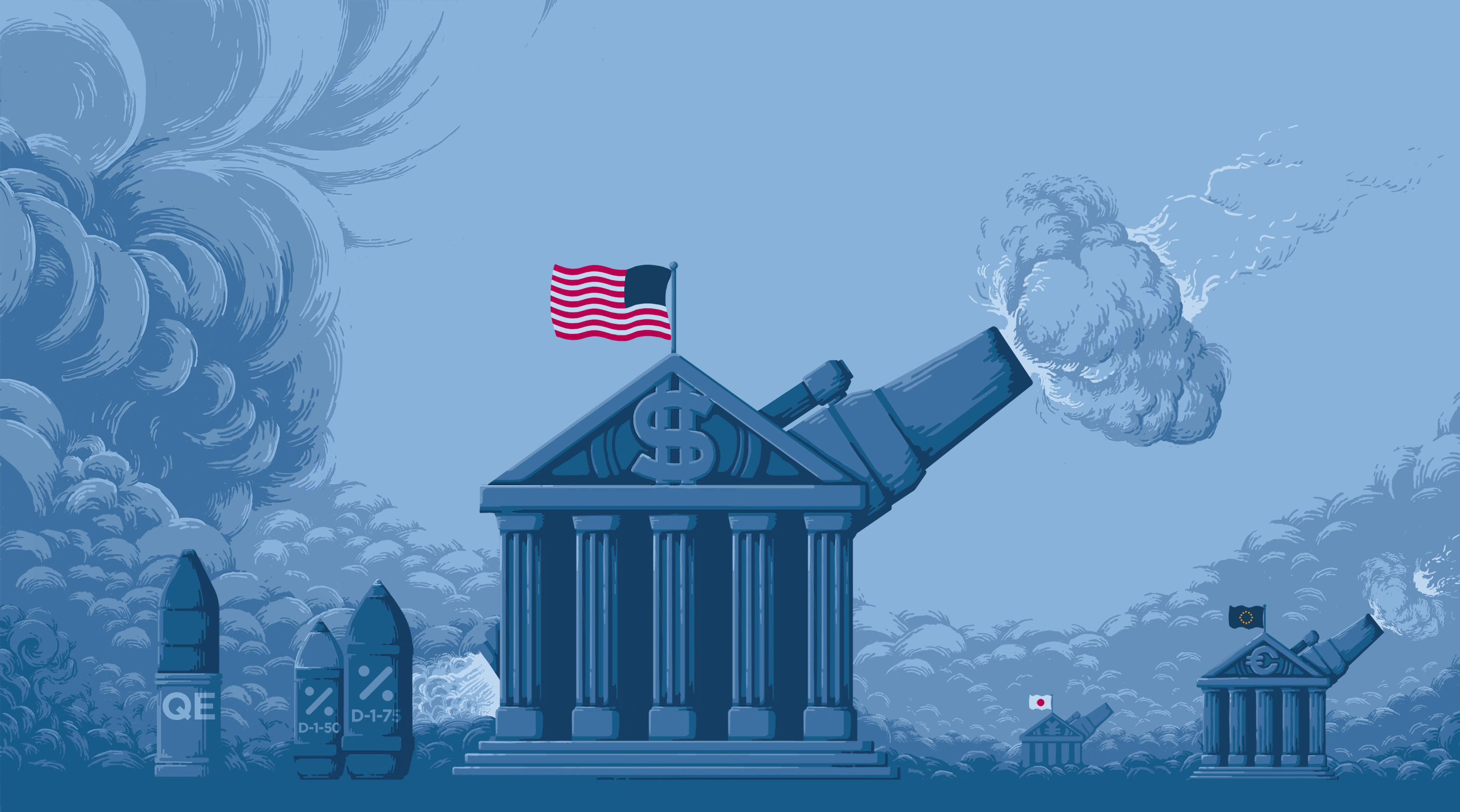
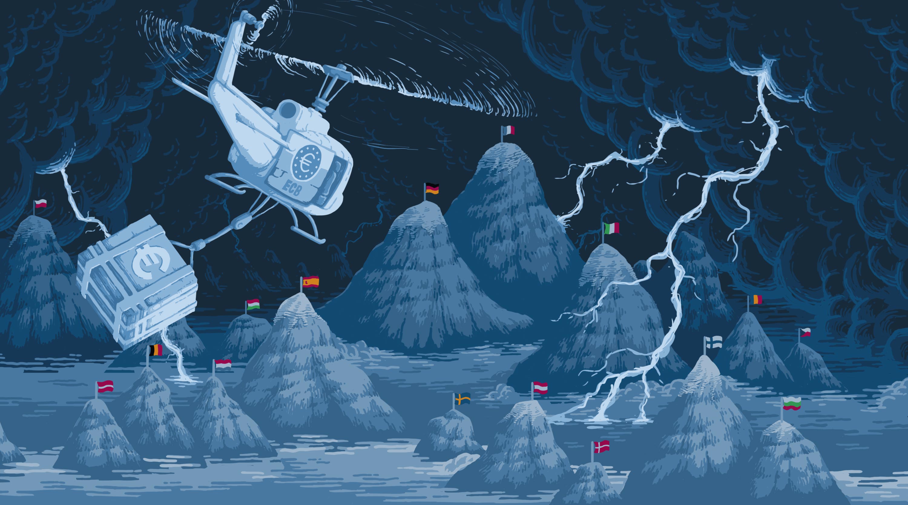
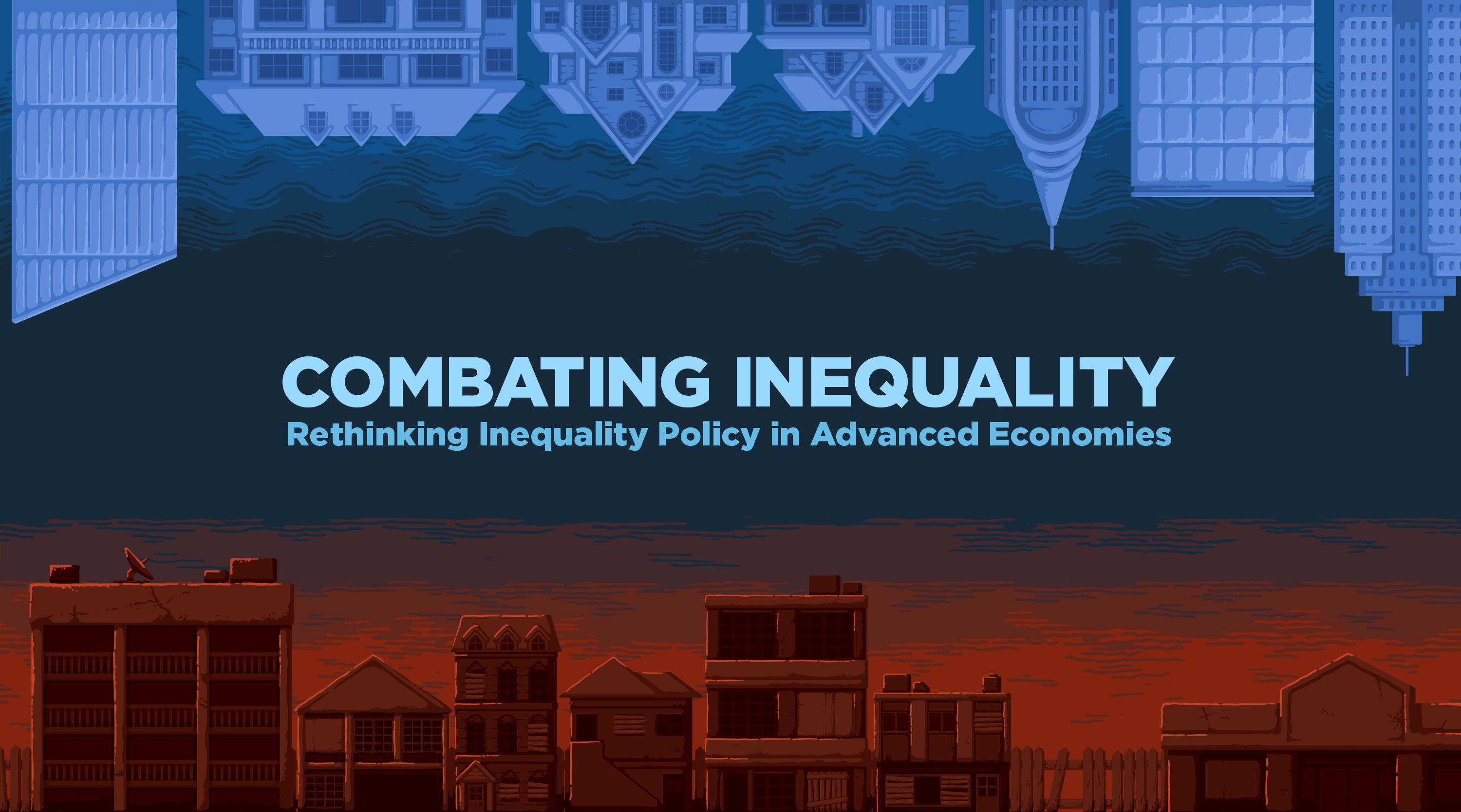
PIIE Illustration Style Update
The PIIE communications department experimented with the use of illustration before I was hired. However, it was relatively unsophisticated and was not a common or particularly useful tool in PIIE's outreach strategy. I re-introduced the idea of using illustration as a way to drum up attention in particularly important or newsworthy projects.
We wanted the illustrations to have a specific visual style that would tie it to the PIIE brand. The illustrations also needed to have a refined tone appropriate for a major Washington DC think tank, while still being visually interesting. The use of monochromatic blue with additional spot colors called back to the heavy use of blue in PIIE's charts and branding. The deliberate use of a constrained color palette set our illustrations apart from clip art and other stock imagery while adding an air of sophistication to the tone of the illustration. We avoided the minimalist style that was popular, but overused, at the time, and leaned into a format that had a high economy of stroke but was still detailed and fairly intricate.
Illustration is used sparingly in PIIE publications but has been very effective at adding visual interest and elegance to our publications. They have been especially useful in our long-form educational material, which needs to appeal to a more general audience.
Style Update
NewOld

Examples of Peterson Institute Illustrations